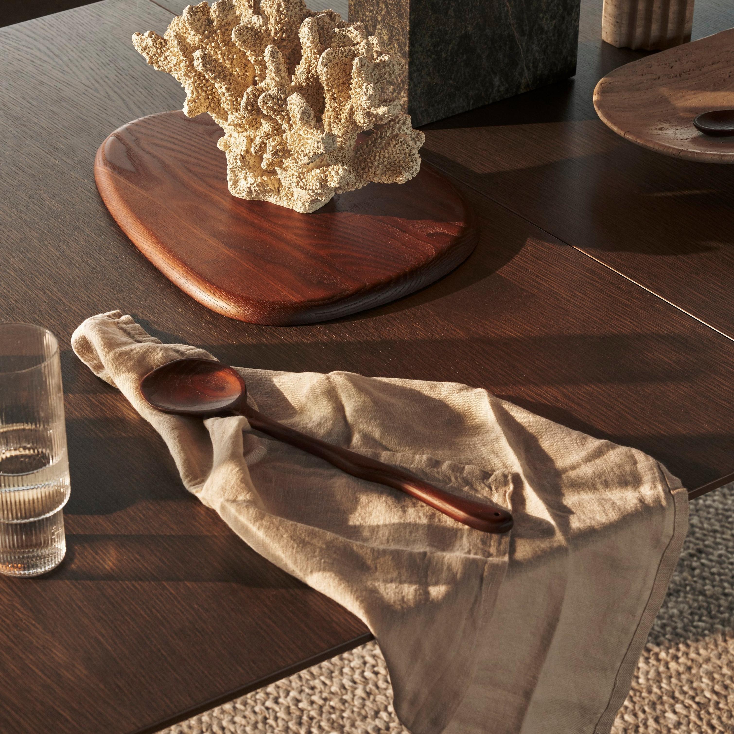
Wander into the warmer end of the palette, where splashes of buttery beige and winks of caramel invite you to sit down and get cozy.
This Scandinavian expression gives a warm and natural touch to a design or space. The colors curated for Scandi-lovers switch out the traditional Nordic base of white and near-whites for warmer, creamier hues.
Create a neutral base with these light, nuanced tones.

Wander into the warmer end of the palette, where splashes of buttery beige and winks of caramel invite you to sit down and get cozy.
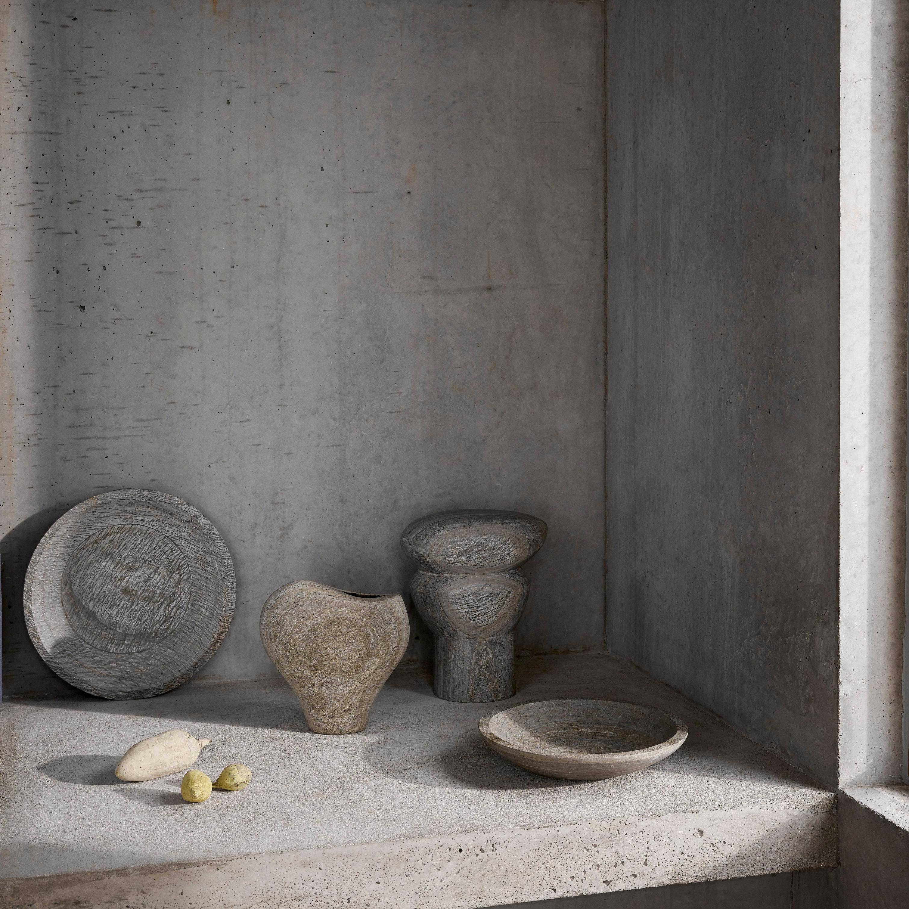
Allow the day to fade to gray. This is the color palette that invites you to enter a space and leave the world at the door.
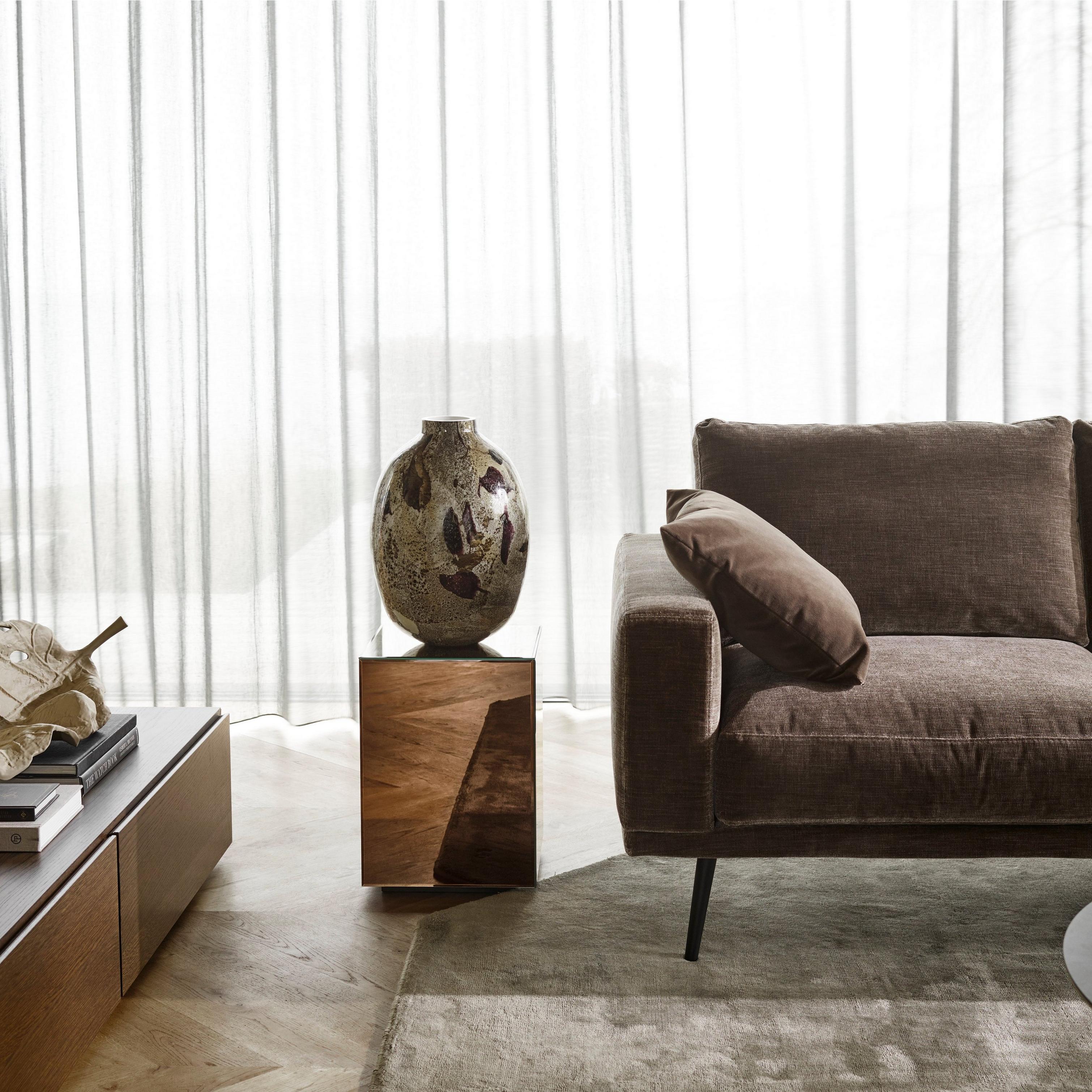
The palette can’t help but be sleek and luxurious, like an indulgent cup of cocoa.
There’s a reason why so many people, all around the world, crave an authentic Scandinavian esthetic for their space. From muted colors to minimalistic designs, a modern Nordic interior is somehow both calming and homely while grand and impressive. This core palette will help you achieve an authentic Scandinavian base, to which you can add pops of your own personal style. It also pairs perfectly with blonde oak, stony ceramics and accents of cement.

a midsummer sunset; shady sand; chai latte; artisan pottery. Everything about it is designed to soothe and calm.
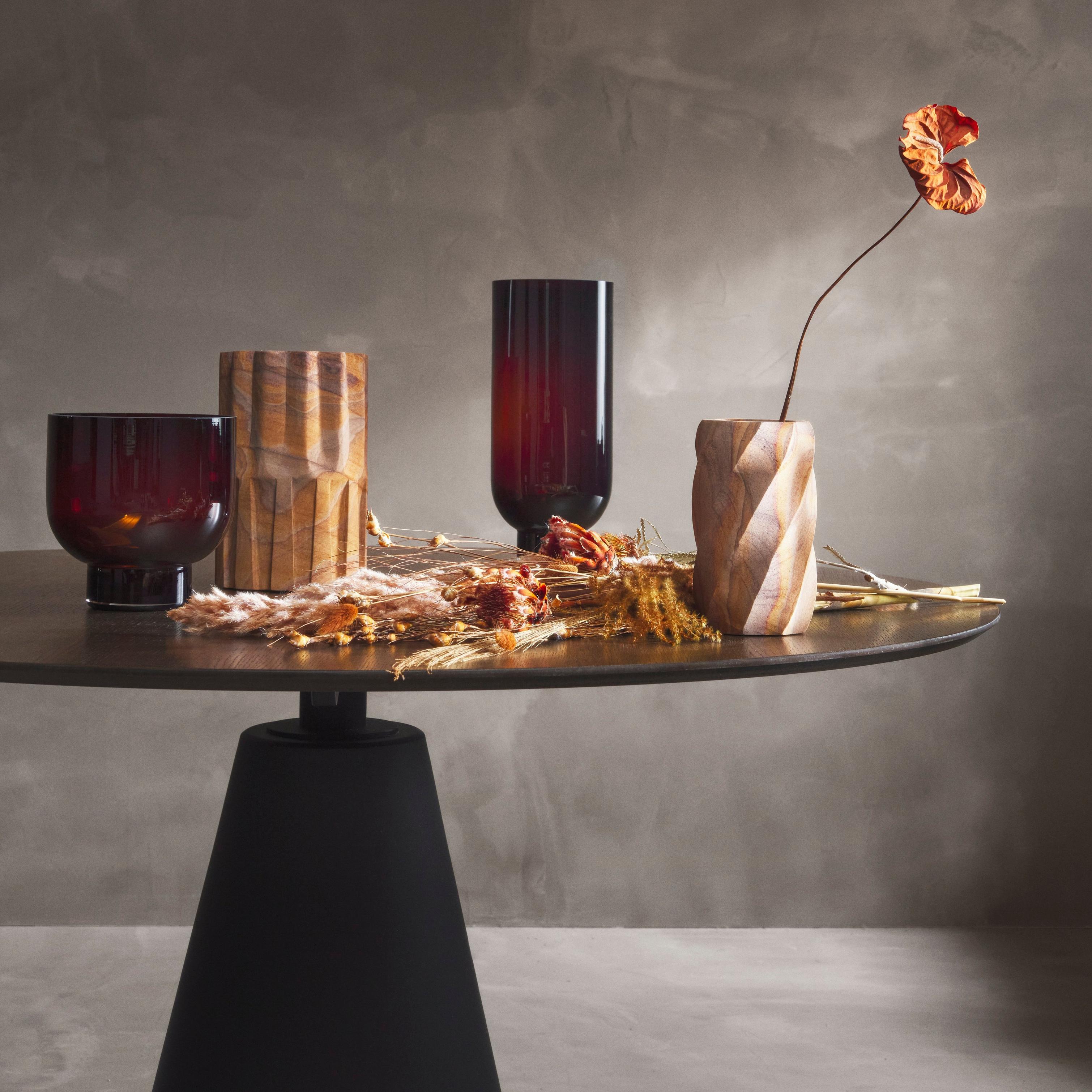
This palette is your permission to see red. A color that demands your attention: shades arrive in rich, deep tones – with Bloodstone entering the palette and intending to stick around.
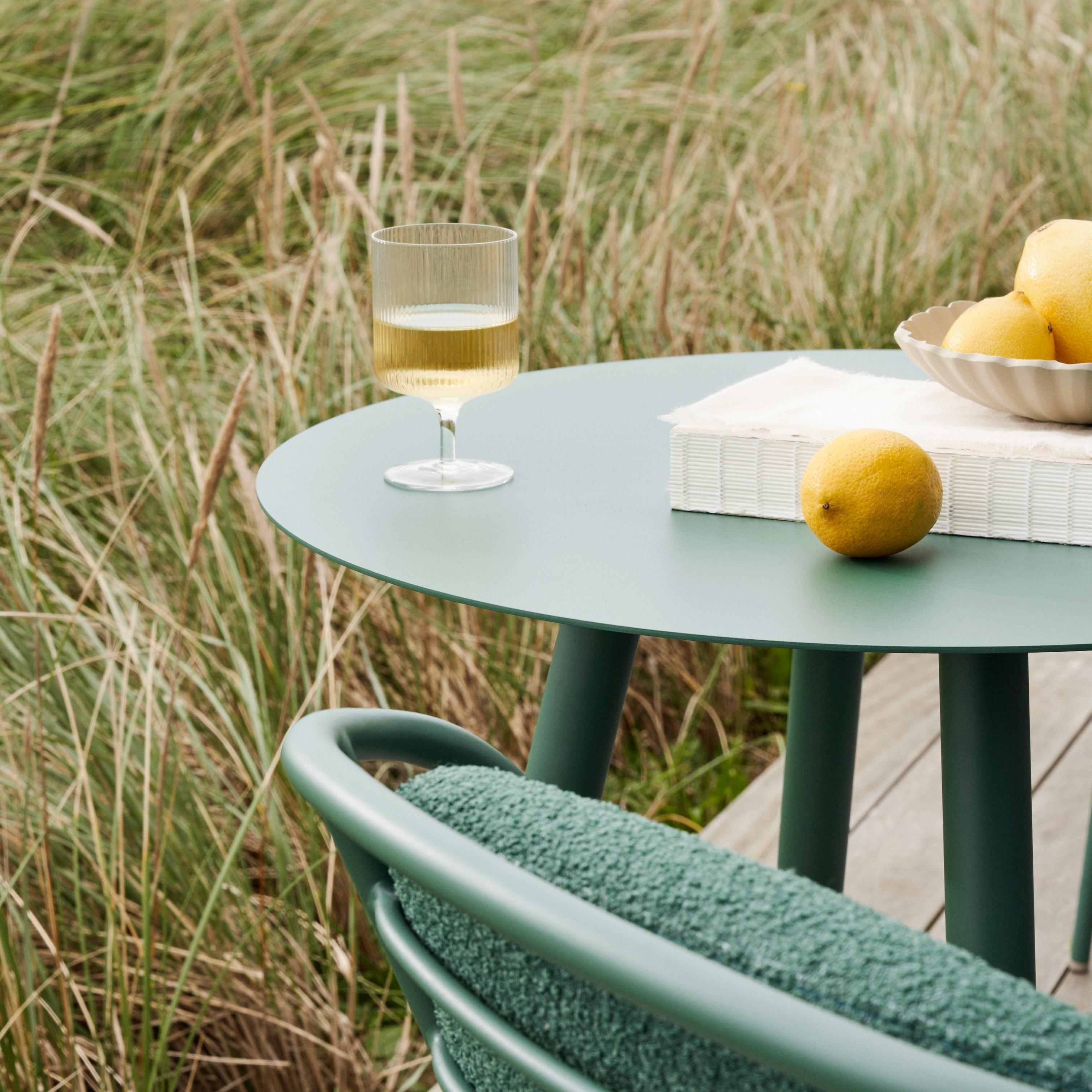
Soothing by nature. These greens will play a key role across all palettes, from lush and dusty to more rooted tones, supporting our longing for the great outdoors.
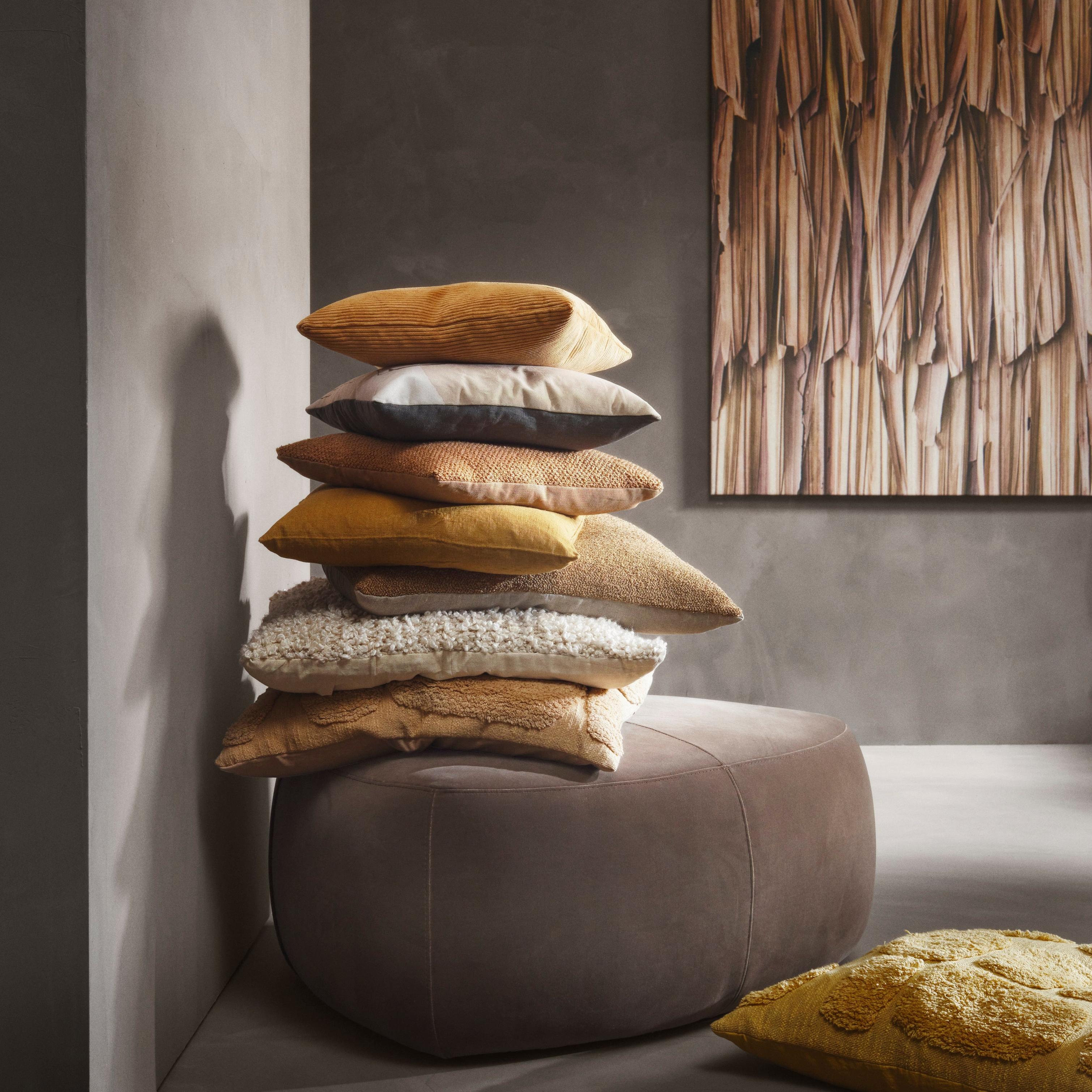
Pairing perfectly with the nuanced neutrals, trust these shades to bring sleek warmth to your overall palette.